Hi there, I’m Schubert!
I build charts and weird interactives on the web while I struggle to fill out a sketchbook on the side.
If it's creative and I've worked on it, you will likely find it in the realms of this site
I build charts and weird interactives on the web while I struggle to fill out a sketchbook on the side.
If it's creative and I've worked on it, you will likely find it in the realms of this site

My current title is "Frontend and Data Visualisation Developer" but often this means little to most people. People may sometimes get the "frontend" part but that's rarely why I love what I get to do for a living.
Data Visualisation (dataviz for short) involves representing information in a way that makes it easier to understand and take action on. This can take the form of charts, storytelling, visual explainers and much more. And if it needs to have its' own space on the web, then that's where I come in.
You can often find me working on bits of projects like:
Charts and Graphics
For when you want your data to make sense at a glance.
Dashboards and Explorers
When you have a lot of data and want to enable others to explore and find the insights they need
Interactive Stories and Visual Explainers
When you want to deep dive into a complex topic and need to engage guide your audience through it step by step.
Dataviz and interactive storytelling lies at the crossroads of several things I'm interested in. I like being able to create things and put it out on the web for others to enjoy. Its a space where we're still figuring things out so there's a lot of experimenting and I have been given far more creative freedom that I should be trusted with.
And the biggest plus is the incredibly talented people that I find myself surrounded with...
None of my projects happen in a vacuum, whether it's a side project or client work. It's a small collection of folks supporting, inspiring and learning from one another that shape the work I put out.
I can't count the number of times a conversation with one of them has lead to me starting a side project, creating art or brainstorming a conference talk idea which would have never got off the ground otherwise.
Hell, even this site would have been a one pager resume if people didn't convince me to own my corner of the internet.
A collection of the things I worked on over the past few years in no particular order.
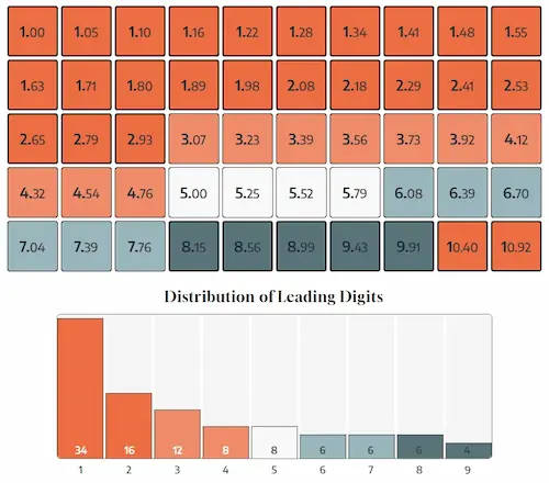
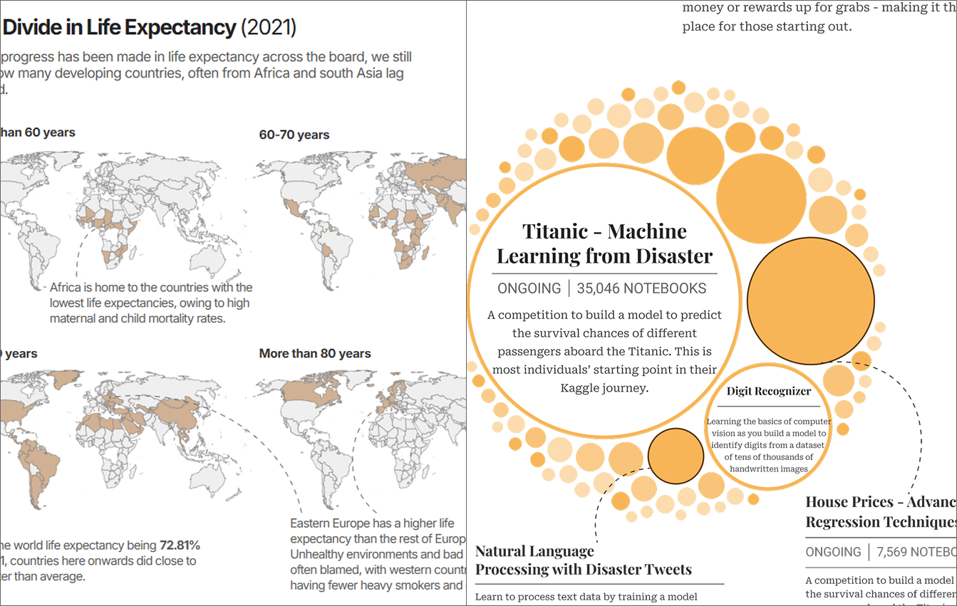
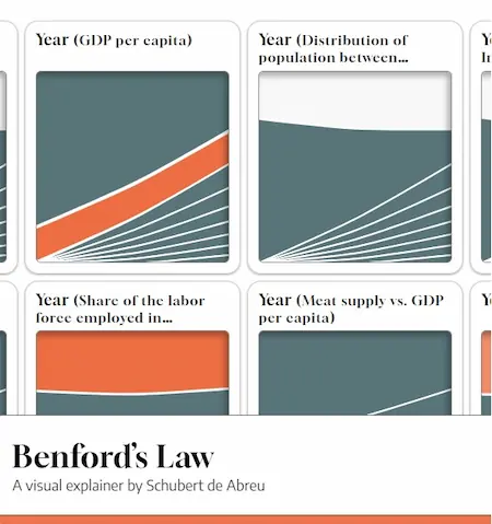
A visual explainer on Benford's Law which was one of the winners of the Pudding Cup 2025
Client:
Personal project
Project:
Interactive Story
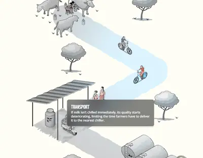
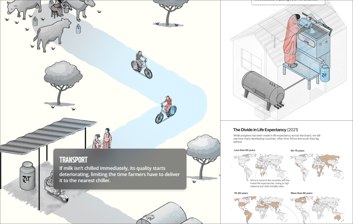
An interactive story on the role of technology in dairy chain in India. Nominated for the Information is Beautiful Awards 2025
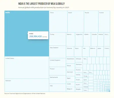
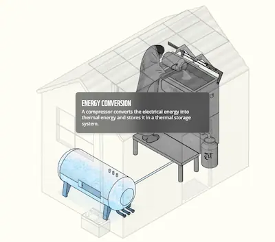
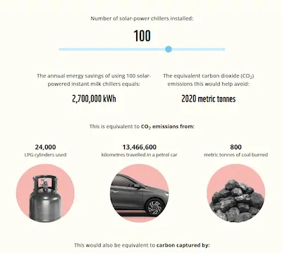
Client:
World Wildlife Fund India
Project:
Interactive Story
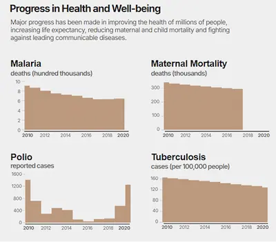
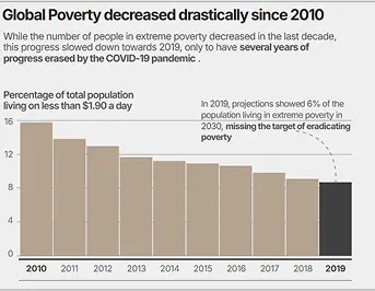
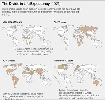
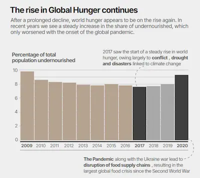
A scrollytelling piece on the shortcomings of the efforts to achieve the UN SDG targets
Client:
Personal project
Project:
Scrollytelling narrative
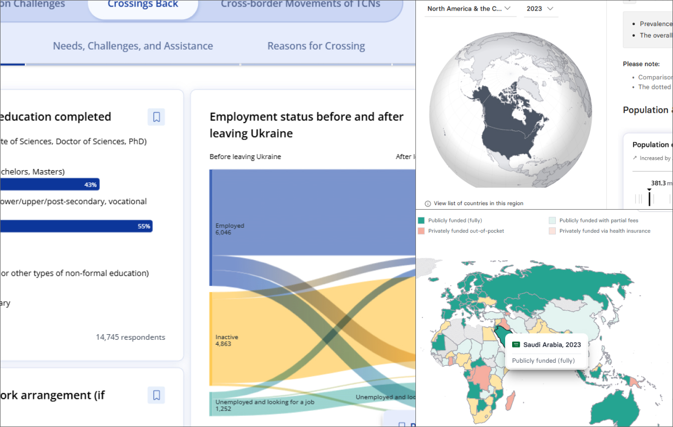
A dashboard to visualize the data collected by the ISN on kidney health around the world
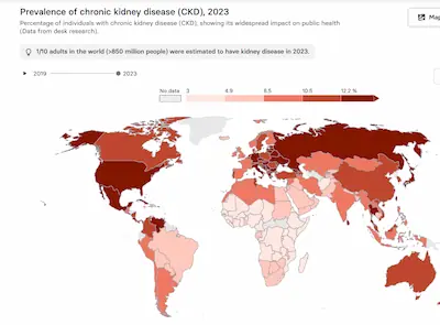
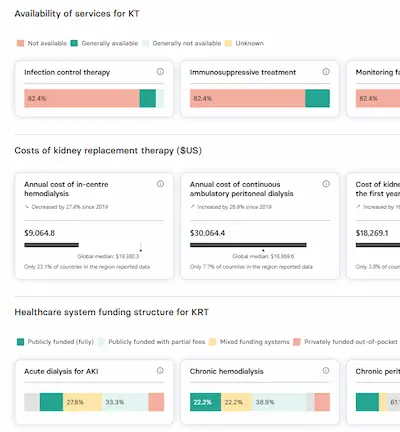
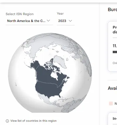
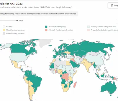
Client:
International Society of Nephrology
Project:
Dashboard
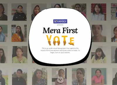
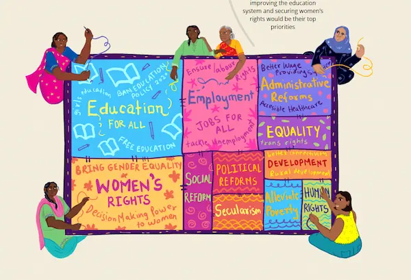
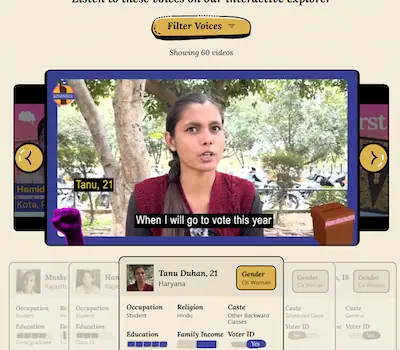
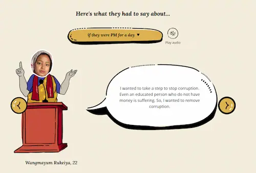
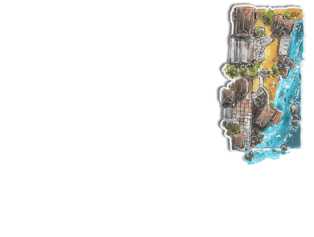
Client:
BehanBox
Project:
Interactive Story
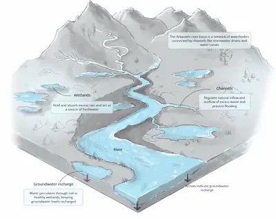
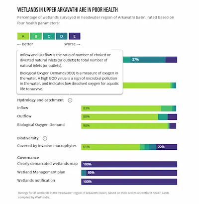
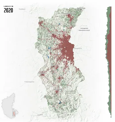
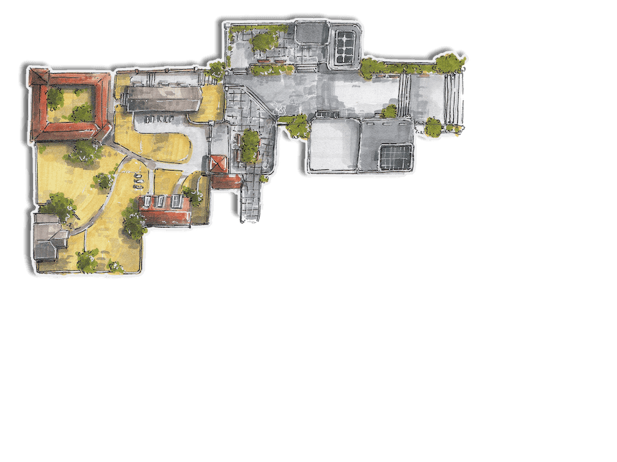
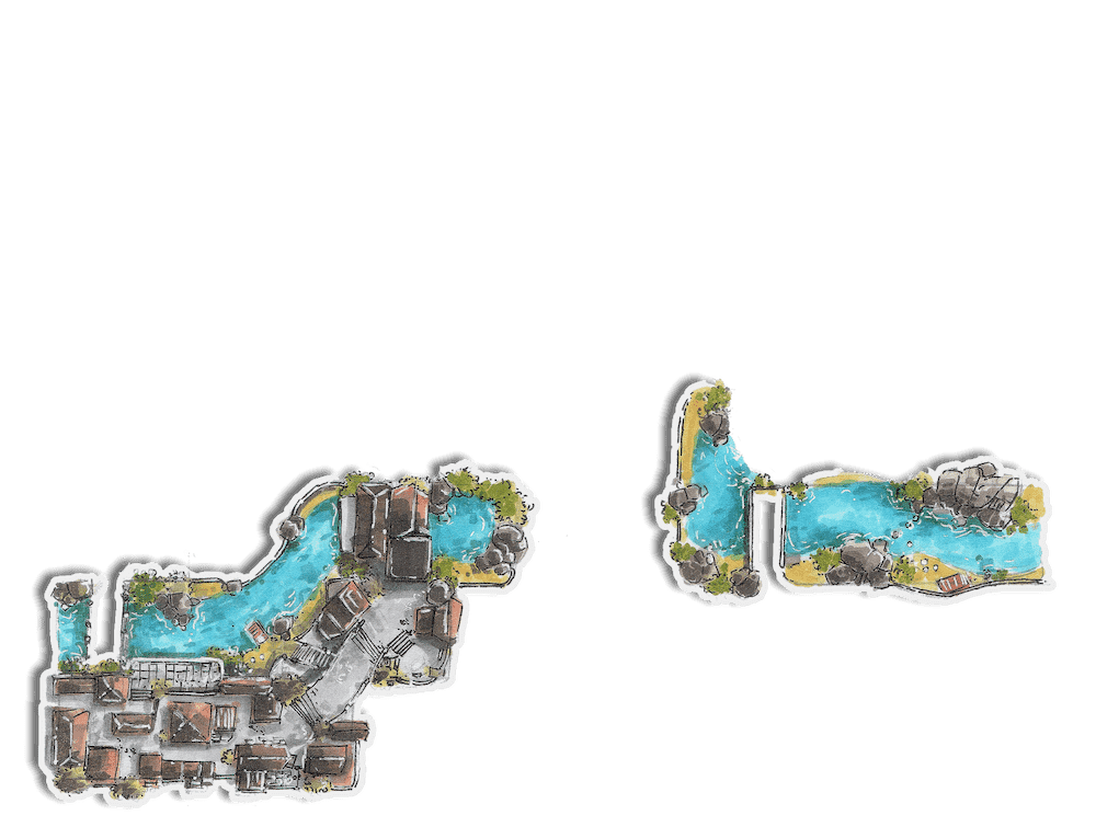
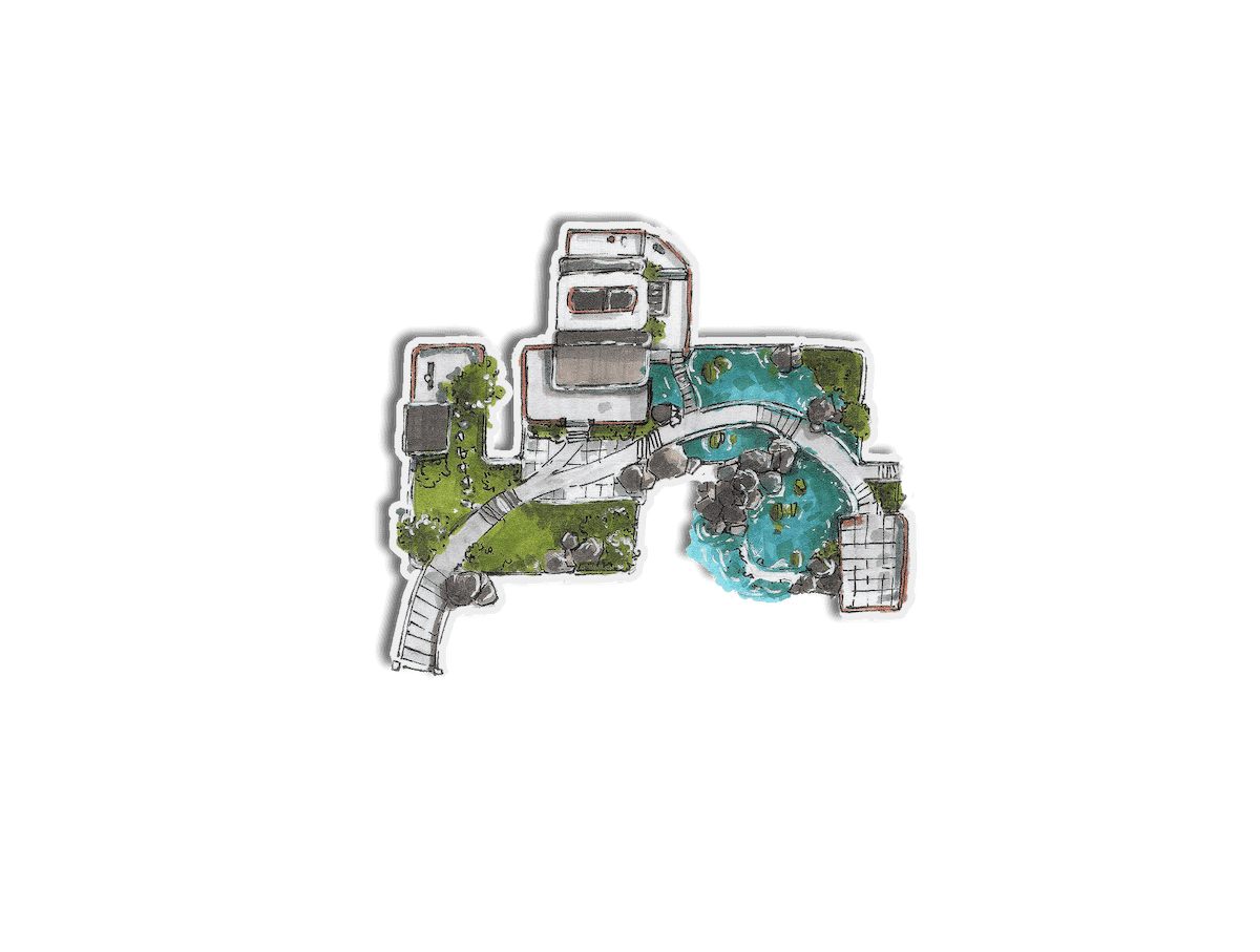
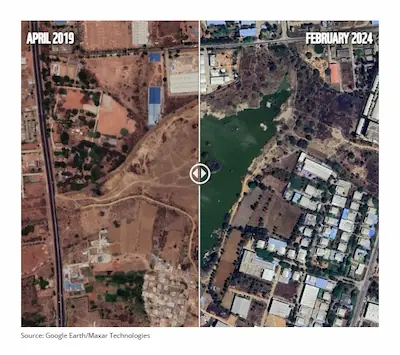
An interactive story on the restoration of the Arkavathi river basin in Karnataka
Client:
World Wildlife Fund India
Project:
Interactive Story